
Sentora has shared its latest chart on the yieldcoin trade, offering a snapshot of where things stand right now. Some assets are still competing based on headline APY, while others are winning because capital keeps flowing into them. The chart compares 30-day average APY against TVL across leading yieldcoins, a split that matters in a market where investors try to balance return, size, and staying power.
The standout in the chart is syrupUSDC, which sits at the top of the APY ranking. Yield alone does not tell the full story, but it is often the first thing market participants notice when scanning such a chart. In simple terms, syrupUSDC appears to offer the most attractive average yield in this group, helping explain why it draws attention in a crowded corner of DeFi. CoinGecko describes syrupUSDC as Maple Finance’s yield-bearing stablecoin, and Messari characterizes it as a product built to give users access to Maple’s decentralized lending pools.
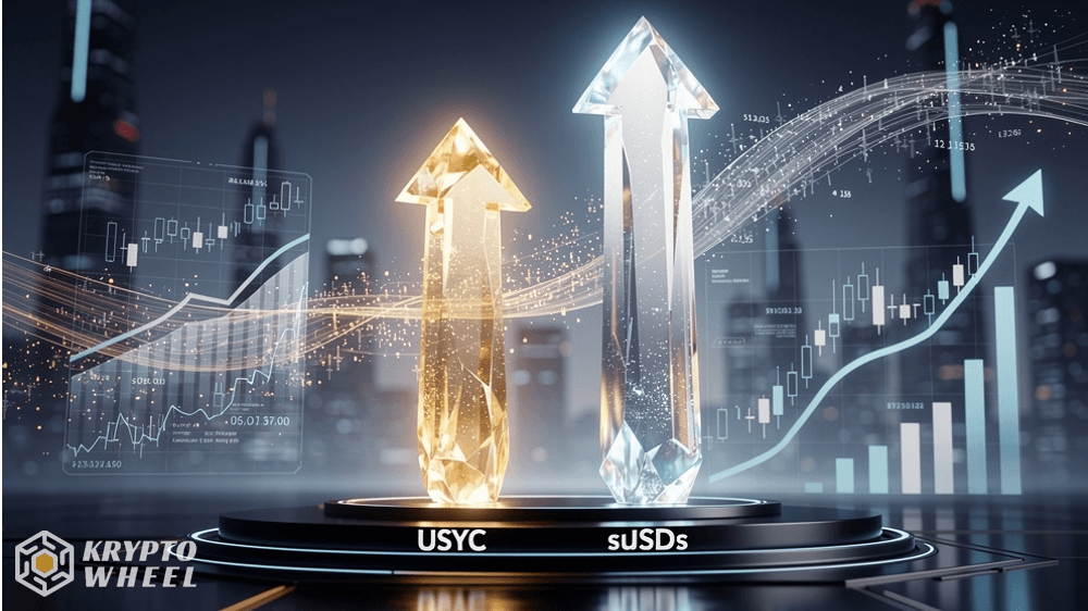
USYC and sUSDS Dominate Supply Growth
But the more interesting part of the chart may be the growth story rather than the yield story. According to the information shared with the chart, USYC and sUSDS are showing the strongest 90-day expansion, each adding more than $1.3 billion in supply. That is a big number, and it suggests the market is not only chasing the highest rate but also consolidating around a few names that are becoming increasingly hard to ignore. In other words, there is a difference between being the highest-yielding product and being the one absorbing the most fresh capital. The chart makes that distinction very clear.
That dynamic fits the broader direction of the market. Yield-bearing stablecoins, often called “yieldcoins,” have grown quickly as investors look for dollar exposure that does more than sit idle. Some market observers have pointed to the category passing $13 billion in combined supply over the past 18 months, which explains why charts like this get more attention now than they did a year ago. The appeal is straightforward: these products try to preserve dollar-like stability while adding a return stream, giving them a different pitch than ordinary stablecoins.
What the Chart Tells Us
What makes the chart worth watching is that it captures the market’s current tradeoff in one frame. On one side, you have yield leaders like syrupUSDC, where the sell is clear and immediate. On the other side, you have assets like USYC and sUSDS, where the bigger story is growth, scale, and the possibility that liquidity is starting to cluster around products with strong traction. That does not automatically mean the highest APY winner becomes the biggest winner, but it suggests that yieldcoin competition is moving beyond simple rate-hunting and into a more mature phase where trust, distribution, and product design matter just as much.
For now, the chart sends a clear message. In yieldcoins, the market is not choosing between yield and size so much as trying to decide how much of each it wants. syrupUSDC is flashing the strongest average return, but USYC and sUSDS are proving that momentum can come from a different direction entirely. That combination makes this part of DeFi interesting right now, because the winners may not be the products with the loudest APY numbers, but the ones that can keep attracting capital after the first wave of attention fades.